Get help with "best image size for website" from a professional.
Digital marketing professionals are the best ROI for your marketing spend.
When designing a website, image optimization is crucial. It has to be Goldilocks here: not too small and not too big.
If web designers choose an image size that is too small it leads to pixelated images and poor display quality.
But if the image resolution is too big, then the page load times can keep users waiting – especially on mobile devices. Ignore website speed at your own peril!
A good website developer understands this and finds the right balance for every single image. Optimized images help speed up load times for users even on mobile devices using 3G.
Use this simple guide to help you determine image sizes for websites.
Step 1: Understand the 2 types of image size measurements

The “size of an image” can have different meanings in the digital world.
Are you talking about byte image size or pixel image size?
Image Dimensions – Measured in Pixels
Physical pictures are measured in inches or centimeters, right?
In the case of digital images, however, the size is measured in the “number pixels wide” x “number of pixels high”. For example, 150 x 150 is the typical size of a small, square thumbnail image.
The smaller the number of pixels, the smaller the file size will need to be. But if you force a smaller image to display on the screen in a size bigger than the pixels in the image then users may start to see distortion.
Aspect Ratio
One thing to keep in mind when discussing image optimization is the aspect ratio. If you change the width or height of an image without making a change in the exact same ratio to the other, then it will warp images.
Don’t worry, tons of tools automate this change, including the optimization tool at the end of this article.
Just remember to only edit one – either the width or the height – and let the tool automate the other side to keep the correct dimensions of images.
How to Find the Pixel Size of an Image on a Website
If you already have an image on your website that you are looking to optimize, go to the web page and then do the following:
1. Right-click on the image and select “Inspect” from the menu. (On Chrome you may have to click Developer Tools > Inspect)

2. Select the image tag in the HTML code and you’ll see the width and height parameters that the image is being displayed at.
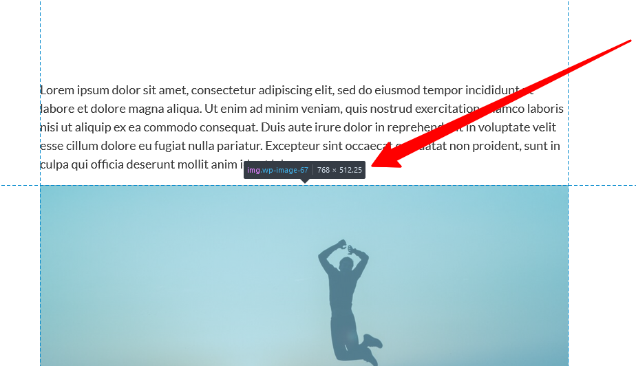
Image File Size – Measured in KB
A bit is a 1 or a 0 and a byte is 8 bits, right?
Then 1,000 bytes is a kilobyte (KB). 1,000 kilobytes is a megabyte and 1,000 megabytes is a gigabyte (gb).
The smaller your image sizes, the faster your website speed. It’s as simple as that.
For websites, it’s best for your file size to never go up to mb or gb.
High-Resolution Displays
To ensure optimal rendered size for high-resolution images on every screen, including Apple’s “Retina Display”, then you may want to double the quality of your image.
Typically this is not necessary, however, and should only be considered if the images on your site are crucial to your business, such as for a photography or artist’s website.
How to find the File Size of an Image on a Website
1. Right-click on the image and select “Open Image in New Tab”. The new tab will open up the image in its full size.
2. Right-click on the image and select “Properties”. The properties window will show you the size of that image in bytes.
When buying stock images, what size is best?
The first question you need to ask yourself is, “How will you use the image?”
Will you ever print the image? If so then you may need a high resolution image with large width x height properties and 300 DPI (dots per inch). The larger your print, the bigger the pixel size you will need.
In that case, download the required size and reduce the image size for your website (see steps below).
Otherwise, never download an image’s width more than 2000 pixels as that is larger than most screens. Even if it’s the same price from the stock photography site, it won’t help you. You just won’t need digital image files that large and they’ll just take up more space on your hard drive.
Will it be used as an edge-to-edge hero image? Or will the image just be a small graphic next to an info box?
If the image will take up the entire screen and you want it to look great on most all screens, then you could go big and take it up to a width of 1920px.
However, 1280px as a maximum width is a good guideline for just about any use, even a hero image.
Step 2: Understand File Formats for Image Files
.jpg vs. .png vs. MOZjpeg vs. .webp vs. .avif
A short and sweet summary of file formats:
Original JPG pictures from your phone/camera are beautiful – but the original file format is far too big (usually mb not kb) to load quickly on websites.
PNG file formats support transparent backgrounds. JPGs don’t. They’re both still too big.
For web pages, use:
- Optimized MOZjpeg (file endings are still .jpg file format, so usable when .jpg image formats are required)
- .webp – the new guy in town, not supported by dead browsers like Internet Explorer
- .avif – the really new and improved kid on the block supported by most browsers but not supported by WordPress out of the box as of this writing (end of 2022).
When will WordPress support .avif (AVIF) file format?
No word on this from the WordPress overlords yet. We will edit this post as soon as they have made any announcements. If they already announced support for .avif images and you heard about it, drop a comment!
What’s the best file format for website images?
They each have their advantages and disadvantages:
- .png is tough to optimize. Don’t use those for your website.
- MOZjpeg is compatible with just about anything – but you can’t have transparent backgrounds.
- .webp is compatible with all modern browsers, WordPress websites and most other popular Content Management Systems (CMS). It also allows for transparent backgrounds. Of course, it’s not as widely adopted as .jpg or .png files though.
- .avif is the ultimate in optimization, but not compatible with a lot of CMS – yet.
Our internal policy for now: use MOZjpeg when possible to allow use of images in a wider range of systems, and use .webp when transparent backgrounds are necessary.
Rules for the Best Image Size on Websites
- Always try to make the image dimensions similar to the size you will use it for on the website
- Keep the file size under 100 kb for normal images
- Go up to 200kb for large images like edge-to-edge hero images.
- The smaller the better. Make sure they look good on your screen.
There are a million ways to optimize your file sizes. We’re going to give you the one the pros use.
How to Optimize Website Images to Achieve the Best Image Size for a Website
Optimize image dimensions and image file size with Squoosh.app for free!
This completely free tool will allow you to simultaneously change the image file size as well as the exact dimensions you are seeking.
- Crop your image before you go to Squoosh. No cropping tool there.
- Go to squoosh.app and drag and drop your image.
- It will automatically optimize for MOZjpeg.
- Move the bar back and forth to compare before and after.
- Toggle the resize button and see if you can make the image dimensions smaller. (To maintain the aspect ratio, be sure to only edit the image width! The height will automatically resize.)
- Select your desired file type (see preferred file types above).
Here’s a little video of how this is done:
Since arriving in Korea in 1995, Steve has dedicated himself to learning about Korean language and culture. Since 2017, he's been helping companies practice data-driven digital marketing.